📊 Mastering ABA Graphs:
How to Visualize and Interpret ABA Data Like a Pro
Introduction: Why This ABA Graphing & Charting Guide Matters
In this practical guide, we’ll show you how to create, read, and use ABA graphs with confidence, whether you’re new to applied behavior analysis or looking to improve how you present data. You’ll learn what makes a great ABA chart, how to choose between scatterplot data and continuous data, and how to avoid the most common mistakes in graphing ABA data.
Too often, professionals rely on clunky or unclear graphs in ABA sessions. Some use inconsistent time intervals. Others mislabel axes or fail to highlight trends. Even more commonly, they create data visuals that confuse rather than clarify. These issues can lead to poor clinical decisions, missed patterns, or ineffective interventions.

Think of Maya, an experienced BCBA who was frustrated that her intervention decisions weren’t getting buy-in. After reviewing her visuals, she realized her ABA data graphs lacked clarity, making it harder for team members to interpret progress. Once she adjusted her approach, using clean line graphs, consistent interval data, and better interpretation, her team became more engaged, and decisions improved.
To help you avoid these setbacks, we’ve also included a free downloadable checklist that walks you through the steps for graphing ABA data correctly, so you can put this guide into action immediately.
Pro Tip: The quality of your ABA chart can directly impact how your data is interpreted, and whether your recommendations are accepted.
Let’s get started
Watch this overview video or read the detailed guide below.
Table of Contents
• Understanding ABA Graphs and Charts
• Choosing the Right ABA Data Graph
• How to Graph ABA Data the Right Way
• Interpreting ABA Graphs with Confidence
• Free Download: ABA Graphing Checklist
• From Amateur to Professional: Graphing Comparison
• Conclusion
• Frequently Asked Questions
Pro Tip: Use this article as a reference guide and revisit each section as your data visualization skills grow.
Understanding ABA Graphs and Charts
An ABA graph is more than a visual, it’s a storytelling tool. Whether you’re showing progress over time, highlighting behavior change, or demonstrating intervention effects, your ABA chart should make patterns crystal clear.
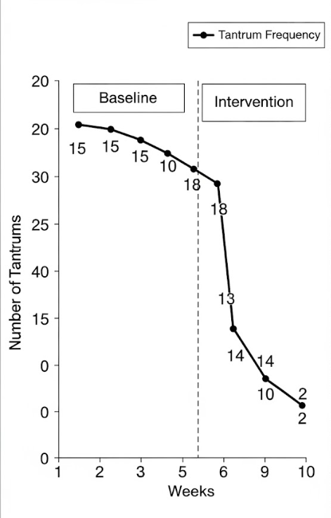
The most commonly used graphs in ABA are line graphs and bar charts. These allow professionals to track changes in behavior, frequency, or duration over time. ABA charts need consistent formatting, titles, labeled axes, baseline and intervention phases, and clear data points.

High-quality graphs in ABA programs make it easier to communicate progress to parents, stakeholders, and team members. They also support data-driven decisions that improve outcomes.
Pro Tip: Always title your aba chart clearly and label axes consistently, this builds trust and saves time when reviewing progress.
Choosing the Right ABA Data Graph
Not all graphs are created equal. The right type of aba data graph depends on the kind of data you’re collecting.
- Continuous data ABA is used when measuring behavior throughout an observation period, such as duration or rate of behavior.
- Interval data ABA focuses on whether or not a behavior occurs within specified time intervals, great for scatterplot data ABA.
- Use scatterplot data ABA when you want to examine patterns across time, like behaviors triggered by specific events or times of day.
Choosing the right type of graph allows for better visual interpretation and helps identify patterns that might otherwise be missed.
Pro Tip: Use scatterplot data ABA for identifying environmental triggers and continuous data ABA when tracking the frequency or duration of behaviors over time.
The Foundation of Data Visualization – Understanding the Power of ABA Graphs
At its core, an ABA graph is more than just a picture; it’s a powerful storytelling tool. ABA graphs are the most effective way to visually represent client progress and program effectiveness.
Rather than sifting through endless rows of numbers, an ABA chart allows you to see patterns, trends, and shifts in behavior at a glance. When we talk about graphs in ABA, we’re talking about a fundamental skill for any behavior analyst. These visual aids transform raw numbers into actionable insights. Having a good ABA data graphs can be the difference between a successful intervention and one that stalls out.
Pro Tip: Think of your graph as the client’s story. A well-designed graph should be so clear that anyone, even someone new to the case, can quickly understand the progress being made.
How to Graph ABA Data the Right Way
Now let’s talk about how to actually graph your ABA data.
Start by selecting your graphing tool (Excel, Google Sheets, or ABA-specific software). Then follow these steps:
- Label your X-axis with time (days, sessions).
- Label your Y-axis with the behavior measurement (frequency, duration, etc.).
- Plot your data with clear markers for each session.
- Add phase lines to show changes in intervention.
- Make sure the graph is easy to read, no clutter, clean lines.
Whether you’re building a simple line graph or a detailed chart, your focus should always be on clarity. Poor visuals can make your work look unprofessional and reduce stakeholder buy-in.
Pro Tip: Avoid cramming too much onto one graph. Simplicity improves understanding, especially when sharing results with families or non-clinical teams.
Interpreting ABA Graphs with Confidence
Once the graph is created, the next step is interpreting aba graphs for actionable insights.
Ask yourself:
- Is there a clear trend?
- Is the behavior increasing, decreasing, or stable?
- Are there abrupt changes at phase lines?
- Does the graph show effectiveness of the intervention?
Graphing ABA data is only valuable when it leads to meaningful interpretation. That’s why professionals must focus on visual analysis, not just reporting numbers.
Pro Tip: When interpreting ABA graphs, always look at both level (overall value) and trend (direction) across phases.
📝 Free Download: ABA Graphing Checklist
To make this even easier, we’ve created a free downloadable checklist you can start using right away. It includes:
- A step-by-step process to build an ABA chart
- Questions to ask while interpreting data
- Visual formatting reminders
- Common mistakes to avoid
Whether you’re working on continuous data ABA or interval tracking, this checklist ensures your graphing process is effective, efficient, and accurate.
Pro Tip: Print and laminate your ABA graphing checklist so it’s always available during team meetings or documentation reviews.
Download: Free ABA Graphing Checklist
From Amateur to Professional: Graphing Comparison
Here’s how many beginners approach graphing versus how professionals should do it:
Amateur Approach:
- Missing labels on axes
- Inconsistent data intervals
- No clear phase lines
- Difficult to interpret patterns
- Generic or untitled charts
Professional Approach:
- Clear, labeled aba chart with consistent formatting
- Use of interval or continuous data aba as appropriate
- Clean, high-contrast visuals
- Data segmented by phase with labels
- Tells a clear story at a glance
Pro Tip: Treat your ABA graphs like executive summaries, make them so clear that even someone unfamiliar with ABA can understand the results quickly.
Conclusion – ABA Graphing and Charting
Whether you’re a behavior analyst, case manager, or educator, mastering ABA graphs is essential to tracking progress, making decisions, and sharing insights. This guide has walked you through how to create, choose, and interpret the right ABA chart for your needs.
By using the right graph for the right situation, and avoiding the most common graphing mistakes, you elevate your professionalism and impact.
Mastering ABA graphs isn’t just a technical skill; it’s the key to becoming a more effective, data-driven professional. By moving beyond a “gut feeling” and embracing the power of visual data, you can make more informed decisions, develop more successful interventions, and ultimately, drive more meaningful progress for your clients. Start by consistently graphing your data, learning to interpret the trends you see, and using your free checklist to stay on track.
Pro Tip: If your data is solid but your graphs don’t clearly show that progress, it’s time to revisit your graphing technique using this guide.
Frequently Asked Questions (FAQ) – ABA Charting and Graphing
What is an ABA graph?
An ABA graph is a visual tool used to track behavioral data over time, helping professionals evaluate intervention success and behavior trends.
How do I know which ABA data graph to use?
Choose based on the type of data you’re collecting. Use continuous data graphs for duration or rate of behavior and interval or scatterplot data ABA for time-based occurrence patterns.
What makes a good ABA chart?
A good ABA chart is clean, labeled, consistent, and tells a story. It should show progress across time, include phase lines, and be easy to interpret by professionals and stakeholders alike.
Why is interpreting ABA graphs important?
Interpreting ABA graphs allows you to make informed decisions about interventions, adjust plans, and ensure your strategies are effective based on visual trends.
Can I use Excel to graph ABA data?
Yes, Excel and other spreadsheet tools work well for basic ABA graphing needs. You can also use specialized ABA software for more advanced options.
Note: Content on this website (casemanagementhub.org) is copyrighted and protected under applicable copyright laws. Unauthorized reproduction, distribution, or use of any content from this Case Management Hub website, without explicit written permission, is strictly prohibited. Read Terms of Use.
Disclaimer: Case Management Hub is an educational resource site. Our content is not medical advice. Always consult a licensed professional for personal guidance. Use of this site does not create a provider-patient relationship. Do not send us personal health information. Read our full disclaimer here: Case Management Hub Disclaimer.


